4 Advanced Data Manipulation and Plotting
It is time to become a pro! Well, becoming a “pro” in R doesn’t strictly that we will have to do complex things, or become some crazy freaks not leaving our laptop and squeaking like lab rats. Becoming a pro means being able to do things in another way. Sometimes an easier way, other times a more complex way that allows us to reach a higher level of output.
Now you will be asking: “If there are easier ways, why did we learn the complex part at the beginning?” Well, Michael Jordan would answer you: “Get the fundamentals down and the level of everything you do will rise.” So, basically, we need the grammar in order to write a sentence.
Now, put your “pro” hat on!
4.1 Ifelse
The ifelse() function allows us to give R multiple inputs according to
one or more conditions. This function is used a lot when cleaning data
and when we want to create new variables.
As an example, we want to generate a variable equal to 1 if the car consumes less than 20, and equal to 0 in all the other cases. Or we can create the same variable with more than one condition. Or we want to create a new variable with more than two levels. Finally, we may want to correct some values according to our conditions.
Within the ifelse() function we are required to specify the
condition(s), comma, the value to give if the condition(s) is true,
comma, the value to give if the condition(s) is false.
Code
# creating a new var conditionally
mtcars$newvar <- ifelse(mtcars$mpg < 20, 1, 0)

# creating a new var with more conditions
mtcars$newvar <- ifelse(mtcars$mpg > 20 & mtcars$cyl < 4, 1, 0)

# creating a new var with more and more conditions in nested way
mtcars$newvar <- ifelse(mtcars$mpg > 20, 100,
                        ifelse(mtcars$mpg < 17, 10 ,
                                ifelse(mtcars$cyl == 6, NA , mtcars$mpg )))
# correctin a variable
mtcars$mpg <- ifelse(mtcars$cyl>5, NA, mtcars$mpg)
#this is the same as
mtcars$mpg[mtcars$cyl>5] <- NA
In the case in which we have a categorical variable with multiple
categories (i.e. the color of the car), and/or we want to create dummies
for multiple categorical variables at once (i.e. the variables: red,
green, blue, etc), I suggest to use the package
fastDummies(Kaplan 2022). Note that in the argument select_columns
you can specify multiple columns using c(). The argument
remove_selected_columns removes the original categorical variable
after the transformation.
Code
4.2 The Apply family
The apply() function is a great facilitator. it applies a function of
our choice to the whole dataset by row, or by column
(Sovansky Winter 2022). This means that, using this function, we can
compute the mean (or a more complex calculus) on all the variables of
the data! So we can create our own summary of the data.
Within the apply() function we have to impute the data we want to
manipulate, comma, if we want it to apply the function row-wise (1) or
column-wise (2), comma, the function we want to apply to the data.
Code
############## apply
# calculate the mean per each column
apply(mtcars, 2, mean)

# filter out rows where the mean of the row is lower than 20
mtcars[-apply(mtcars, 1, mean) < 20,]

# create statistical summary
Stat<-cbind(
  apply(mtcars[,c("mpg", "cyl", "disp", "hp","drat")],2,mean),
  apply(mtcars[,c("mpg", "cyl", "disp", "hp","drat")],2,sd),
  apply(mtcars[mtcars$am==0,c("mpg", "cyl", "disp", "hp","drat")],2,mean),
  apply(mtcars[mtcars$am==1,c("mpg", "cyl", "disp", "hp","drat")],2,mean)
)
colnames(Stat)<- c("Mean", "s.d.", "Mean Automatic", "Mean Manual")
round(Stat,2)
4.3 Dplyr
Following on powerful things, we have the dplyr package
(Wickham and Bryan 2022). Well, this is one of my favorite packages in R. In fact,
dplyr allows us to do almost all that we have seen until now in an
easier and, sometimes, more intuitive way.
Dplyr is a grammar of data manipulation, providing a consistent set of
verbs that help us solve the most common data manipulation challenges.
Basically, dplyr allows us to execute multiple functions a cascade. By
using the symbol %>% at the end of each line, we tell R that the code
continues with another function (in fact R gives us an indent in the
following line)(Wickham and Bryan 2022).
The code below allows us to see at glance the big potential of this package. First we filter the Star Wars characters by skin color; secondly we compute the Body Mass Index (bmi) of all the characters, and select only some columns from the original data; finally for each species, we compute the number of characters and their average mass, and we filter only the groups with more than one character and an average mass above 50.
Code
# loading the package and data
library(dplyr)
data(starwars)

# subsetting by skin color
starwars %>%
        filter(skin_color=="light")

# creating a new variable and subsetting some columns
starwars %>%
        mutate(bmi = mass/((height/100)^2)) %>%
        select(name:mass, bmi)

# creating a new dataset, summarizing the data grouped by species and filtering
# the most interesting information
prova <- starwars %>%
        group_by(species) %>%
        summarise(n = n(),
                  mass = mean(mass, na.rm = TRUE)) %>%
        filter(n > 1,
               mass > 50)
So, using dplyr, with one command, we can ask R to group the data by a
categorical variable (group_by()), subset the data according to our
conditions (filter()), select only few variables to be retrieved
(select()), manipulate the current variables or create some new ones
(mutate()), summarize the data (summarize()), etc… Of course, all
of the above can be alternatively done using the indexing system and
multiple functions, but I live to you the choice.
4.4 Merging datasets
In R we can load multiple dataset and data formats in the memory, and use them together. However, sometimes we want to have data from different sources within the same object. This entails merging datasets together. We may want to outer join, left join, cross join. And more often, we may not be sure about what we want! My suggestion is to first clear our mind by reading the following options:
Outer join merges the two datasets by a specified variable and keeps all the observations
(all = TRUE).Left outer merges all the observations of object \(y\) on \(x\) only if they have a corresponding \(id\) variable (corresponding means that the variable has the same name and type).
Right outer merges all the observations of \(x\) on \(y\) only if they have a corresponding \(id\) variable (corresponding means that the variable has the same name and type).
Cross or cartesian product is one kind of join where each row of one dataset is joined with other. So if we have a dataset of size \(m\) and if we join with other dataset with of size \(n\), we will get a dataset with \(m*n\) number of rows.
Within the merge() function we are asked to specify the dataset \(x\),
comma the dataset $y$, comma, the name of the \(id\) variable, comma,
additional arguments depending on which merge we are interested in.
Code
4.5 Melting vs Transposing
I wrote in the previous chapter that the most important rule is that, in a dataset, each row has to be an observation and each column has to represent a variable. Now it is time to break this rule! In fact, sometimes we need a different shape of dataset, usually when we want to plot multidimensional data.
Melting data sounds strange, however this is what we want to do if we have a wide dataset (a lot of variables) and we want to transform it in a “long” dataset (only a few variables), but retaining all the information.
Please remember: melting is not transposing! Transposing (t()
function) is useful when we have data in columns that we need to
rearrange in rows, while melting (melt()) creates a “long” dataset
with more variables in the same column. Note that the melt() function
belongs to the package reshape2(Anderson 2022).
The code below generates a dataset, then transposes it, and melts it.
The melt() function requires us to specify the data we want to melt,
comma, the name of the variable(s) we want to retain as they are. We
will see in the following chapter how to use melted data.
Code
4.6 Ggplot2
Ggplot2 is one of the most famous packages in R, and probably also one
of the most used. It allows us to draw almost all those beautiful graphs
for which R is known worldwide (Wickham 2016; Chang 2018). The main
advantage of ggplot2 is its deep underlying grammar, which lets us
create a simple, expressive and descriptive code for plotting. Plots can
be built up iteratively, and edited in a second moment.
The ggplot() function tells R to generate the Cartesian axes where we
will place the graph, but this is yet not a graph yet. Within this line
we usually specify the dataset from which ggplot has to take the data,
and the variables corresponding to the Cartesian axes (using aes()).
After having specified the ggplot() function we can put a + sign
that will express our intention to put an additional layer on top of the
Cartesian space using the dedicated functions: geom_point() for a
scatter plot, geom_smooth() for a regression line, geom_bar() or
geom_col() for a bar chart, just to mention a few of them (for a
description of the meaning of the above mentioned graph refer to the
Data visualization chapter).
Code
We can add more and more layers to the graph, and personalize all the
things we want. The code below generates two types of regression lines
(more details in [Linear Regression]), and divides data in plots
according to a variable (facets_grid()). As you can see, I tend not
to assign my plot to an object, unless it is strictly necessary. This is
my way of working, but you are free to do as you prefer.
Code
library(ggplot2)
# Adding More Layers: regression line
ggplot(data=mtcars, aes(x=mpg, y=hp)) +
  geom_point() +
  geom_smooth() # Generalized additive models

ggplot(data=mtcars, aes(x=mpg, y=hp)) +
  geom_point() +
  geom_smooth(method = "lm") #linear regression

# Adding More Layers: Facets
ggplot(data=mtcars, aes(x=mpg, y=hp)) +
  geom_point() +
  geom_smooth(method = "lm") +
  facet_grid(. ~ cyl)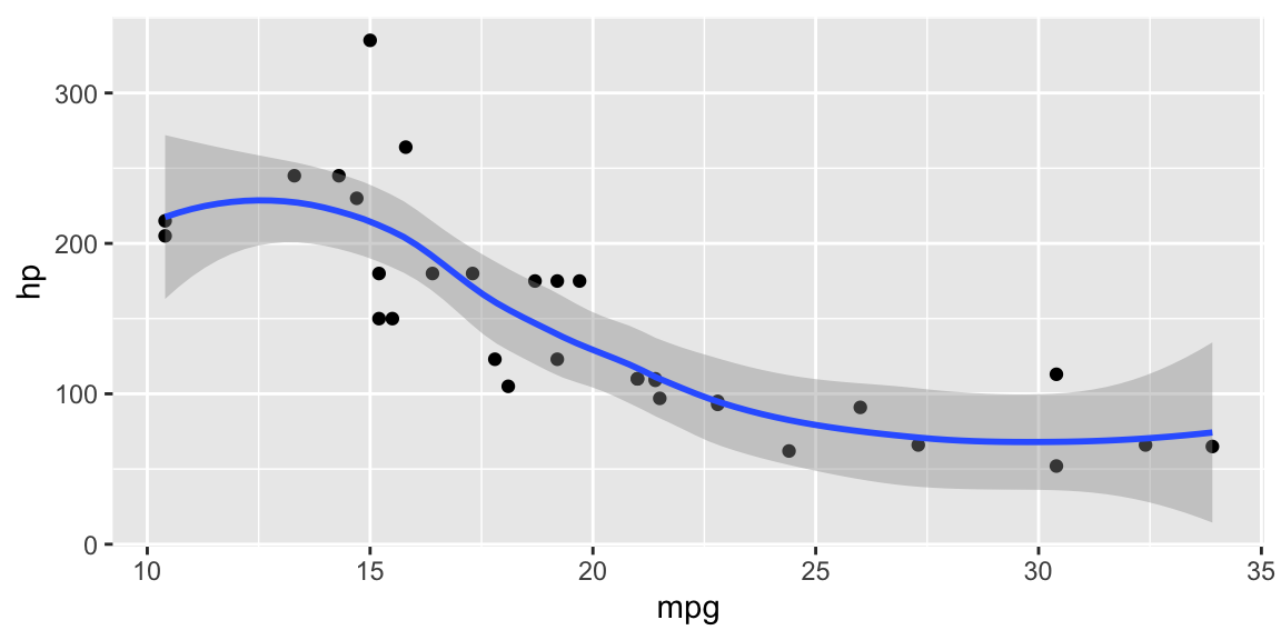
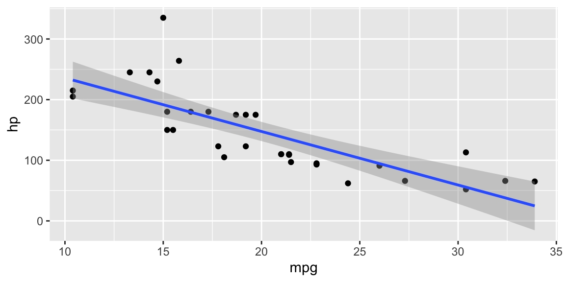
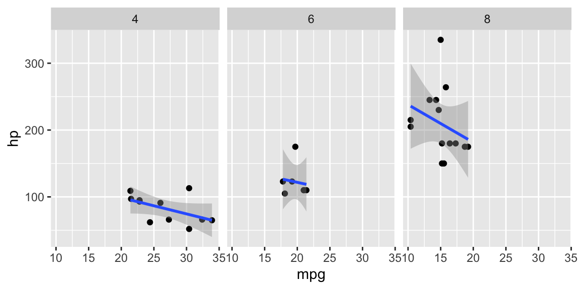
Figure 4.1: From top-left clockwise: Regression line GAM; Linear regression line; Facets.
Following an example application of the need for melting data for the
scope of plotting multidimensional phenomenons. In this case, we have a
dataset with some students and we want to plot their scores, but we want
to be able to clearly see a trend for each one of them? A solution could
be the paired (specifying position = 'dodge') bar chart below.
Code
# creating data
people <- data.frame(name = c("Mary", "Mike", "Greg"),
                     surname = c("Wilson", "Jones", "Smith"),
                     age = c(44, 52, 46),
                     IQ = c(160, 95, 110))

# melting data
library(reshape2)
melted_people <- melt(people, id = c("name", "surname"))

# plotting
ggplot(data = melted_people, aes(x = name, y = value, fill = variable)) +
  geom_col(position = 'dodge')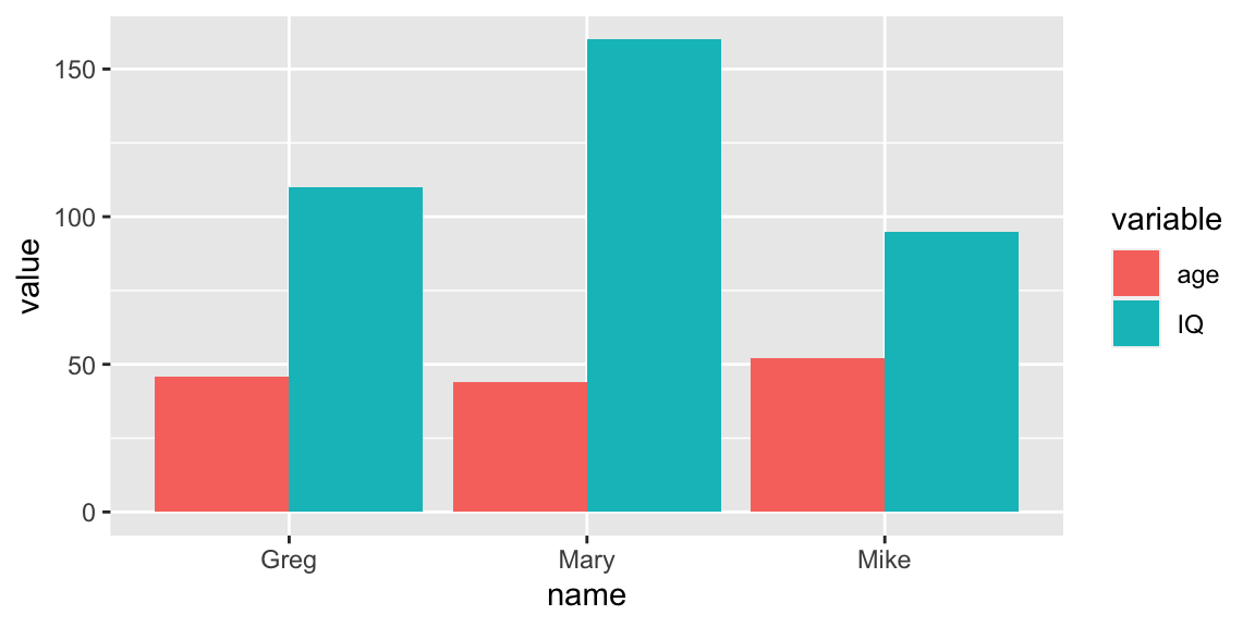
Figure 4.2: Paired barchart.
We are able to personalize almost everything as we like using ggplot2.
The Ggplot2 Cheatsheet gives us some of the most important options. I strongly suggest to look
also at the R Graph Gallery which
includes advanced graphs that are done using ggplot2 or similar
packages, and provides the code for replicating each one of them.
Code
# labeled points
ggplot(mtcars, aes(x = hp, y = mpg, size = wt)) +
  geom_point(aes(color = as.factor(cyl)), alpha=.7) +
  geom_text(aes(label = row.names(mtcars)), size = 3, nudge_y = -.7) +
  theme_bw(base_family = "Times")

# Violin plot
data("InsectSprays")
ggplot(InsectSprays, aes(spray, count, fill=spray)) +
  geom_violin(colour="black") +
  xlab("Type of spray") +
  ylab("Insect count") +
  theme_minimal()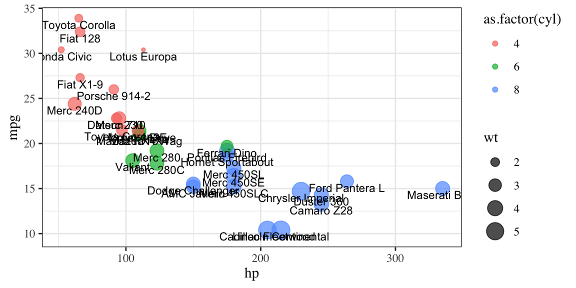
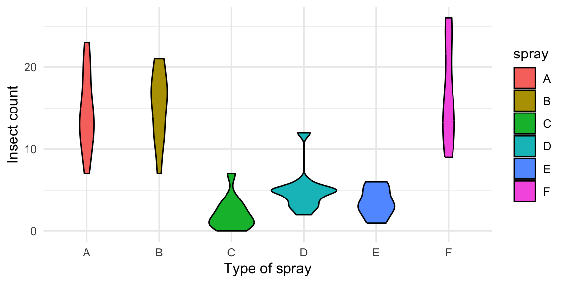
Figure 4.3: From top-left clockwise: Labeled scatterplot; Violin plot.
Finally, I want to show you what to do if we have some outliers in our
data, but we need to plot the main trend excluding them. Below some
different versions of ggplot code that put a limit to the y axes (but it
could be done for the x axes too using xlim() instead of ylim()).
Try the code and see the difference.
Code
# creating data
testdat <- data.frame(x = 1:100,
                      y = rnorm(100))
testdat[20,2] <- 100  # Outlier!

# normal plot
ggplot(testdat, aes(x = x, y = y)) +
        geom_line()

# excluding the values outside the ylim range
ggplot(testdat, aes(x = x, y = y)) +
        geom_line() +
        ylim(-3, 3)

# zooming in a portion of the graph
ggplot(testdat, aes(x = x, y = y)) +
        geom_line() +
        coord_cartesian(ylim = c(-3, 3))