7 Bivariate Analysis
7.1 Correlation
We will now point our imaginary boat towards the Relationship Islands. When we see one thing vary, we perceive it changing in some regard, as the sun setting, the price of goods increasing, or the alternation of green and red lights at an intersection. Therefore, when two things covary there are two possibilities. One is that the change in the first is concomitant with the change in the second, as the change in a child’s age covaries with his height. The older, the taller. When higher magnitudes on one thing occur along with higher magnitudes on another and the lower magnitudes on both also co-occur, then the things vary together positively, and we denote this situation as positive covariation or positive correlation. The second possibility is that two things vary inversely or oppositely. That is, the higher magnitudes of one thing go along with the lower magnitudes of the other and vice versa. Then, we denote this situation as negative covariation or negative correlation. This seems clear enough, but in order to be more systematic about correlation more definition is needed.
We start with the concept of covariance, which represents the direction of the linear relationship between two variables. By direction we mean if the variables are directly proportional or inversely proportional to each other. Thus, if increasing the value of one variable we have a positive or a negative impact on the value of the other variable. The values of covariance can be any number between the two opposite infinities. It’s important to mention that the covariance only measures the direction of the relationship between two variables and not its magnitude, for which the correlation is used.
In probability theory and statistics, correlation, also called correlation coefficient, indicates the strength and direction of a linear relationship between two random variables (Davis 2021; Madhavan 2019; Wilson 2014). In general statistical usage, correlation or co-relation refers to the departure of two variables from independence. In this broad sense there are several coefficients, measuring the degree of correlation, adapted to the nature of data. The best known is the Pearson product-moment correlation coefficient (\(\rho\)), which is used for linearly related variables and is obtained by dividing the covariance of the two variables (\(\sigma_{xy}\)) by the product of their standard deviations (Equation (7.1).
\[\begin{equation} \rho=\frac{\sigma_{xy}}{\sigma_x*\sigma_y} \tag{7.1} \end{equation}\]
A second measure is the Spearman’s rank correlation coefficient (\(\rho_{R(x),R(y)}\)) which is a nonparametric measure of rank correlation defined as the Pearson correlation coefficient between rank variables (Equation (7.2)).
\[\begin{equation} \rho_{R(x),R(y)}=\frac{cov{(R(x),R(y))}}{\sigma_{R(x)}*\sigma_{R(y)}} \tag{7.2} \end{equation}\]
While Pearson’s correlation assesses linear relationships, Spearman’s correlation assesses monotonic relationships (whether linear or not). It is, thus, fundamental a theoretical assumption taken before choosing the right measure. Two variables \(x\) and \(y\) are positively correlated if when \(x\) increases \(y\) increases too and when \(x\) decreases \(y\) decreases too. The correlation is instead negative when the variable \(x\) increases and the variable \(y\) decreases and vice-versa. The sign of \(\rho\) depends only on the covariance (\(\sigma_{xy}\)). The correlation coefficient varies between -1 (perfect negative linear correlation) and 1 (perfect positive linear correlation), and if it is equal to zero the variables are independent.
The code below allows you to compute the correlation coefficient between two variables, and then a correlation matrix, which is a table showing the correlation coefficients between each pair of variables. Note that the first line of code suppresses the scientific notation, allowing the results of the future calculation to be expressed in decimals even if they are really really small (or big) values.
Code
Because a correlation matrix may result dispersive and difficult to study, especially when we have a high number of variables, there is the possibility to visualize it. In fact, if the variables are correlated, the “scatter” points have a trend very known: if the trend is linear the correlation is linear.
The code below provides you with some examples. The function pairs()
is internal to R and gives us the most basic graph, while the function
corrplot() belongs to the corrplot package and provides a more
stylish and customizable graph (Wei and Simko 2021). Finally, the most interesting
(but advanced) version of a pair plot is offered by the GGally package
with the function ggpairs()(Emerson et al. 2012). This function allows us to
draw a correlation matrix that can include whatever kind of value or
graph we want inside of each cell.
Code
The last measure of relationship we will talk about is the chi-squared test (also known as \(\chi^2\) test). This is a hypothesis test statistics that comes into play when dealing with contingency tables and relatively large sample sizes. In simpler terms, the chi-squared test is primarily employed to assess whether there’s a relationship between two categorical variables in terms of their impact on the test statistic. The purpose of the test is to evaluate how likely the observed frequencies would be assuming the null hypothesis (\(H_0\)) is true. Test statistics that follow a \(\chi^2\) distribution occur when the observations are independent.
Code
The code above computes the \(\chi^2\) test for the number of cilinders of a car and the presence of manual transmission. Since we get a p-Value less than the significance level of 0.05, we reject the null hypothesis and conclude that the two variables are in fact dependent.
Cramér’s V (sometimes referred to as Cramer’s \(\phi\)). This is a measure of association between two categorical variables (or categorical) based on Pearson’s \(\chi^2\) statistic and it was published by Harald Cramér in 1946. Cramér’s V, gives us a method that can be used when we want to study the intercorrelation between two discrete variables, and may be used with variables having two or more levels. It varies from 0 (corresponding to no association between the variables) to 1 (complete association) and can reach 1 only when each variable is completely determined by the other. Thus it does not tell us the direction of the association.
7.2 Linear Regression
Linear regression examines the relation of a dependent variable (response variable) to specified independent variables (explanatory variables). The mathematical model of their relationship is the regression equation. The dependent variable is modelled as a random variable because of uncertainty as to its value, given only the value of each independent variable. A regression equation contains estimates of one or more hypothesized regression parameters (“constants”). These estimates are constructed using data for the variables, such as from a sample. The estimates measure the relationship between the dependent variable and each of the independent variables. They also allow estimating the value of the dependent variable for a given value of each respective independent variable.
Uses of regression include curve fitting, prediction (including forecasting of time-series data), modelling of causal relationships, and testing scientific hypotheses about relationships between variables. However, we must always keep in mind that a correlation does not imply causation. In fact, the study of causality is as concerned with the study of potential causal mechanisms as it is with variation amongst the data (Imbens and Rubin 2015).
The difference between correlation and regression is that whether in the first \(x\) and \(y\) are on the same level, in the latter one \(x\) affect \(y\), but not the other way around. This has important theoretical implications in the selection of \(x\) and \(y\). The general form of a simple linear regression is (7.3):
\[\begin{equation} y=\beta_0+\beta_1x+e \tag{7.3} \end{equation}\]
where \(\beta_0\) is the intercept, \(\beta_1\) is the slope, and\(e\) is the error term, which picks up the unpredictable part of the dependent variable \(y\). We will sometimes describe 1.1 by saying that we are regressing \(y\) on \(x\). The error term \(e\) is usually posited to be normally distributed. The \(x\)’s and \(y\)’s are the data quantities from the sample or population in question, and \(\beta_0\) and \(\beta_1\) are the unknown parameters (“constants”) to be estimated from the data. Estimates for the values of \(\beta_0\) and \(\beta_1\) can be derived by the method of ordinary least squares. The method is called “least squares”, because estimates of \(\beta_0\) and \(\beta_1\) minimize the sum of squared error estimates for the given data set (Equation (7.4)), thus minimizing:
\[\begin{equation} RSS=e_1^2+e_2^2+...+e_n^2 \tag{7.4} \end{equation}\]
The estimates are often denoted by \(\hat\beta_0\) and \(\hat\beta_1\) or their corresponding Roman letters. It can be shown that least squares estimates are given by
\[\begin{equation} \hat\beta_1=\frac{\sum_{i=1}^N(x_i-\bar{x})(y_i-\bar{y})}{\sum_{i=1}^N(x_i-\bar{x})^2} \\ \hat\beta_0=\bar{y}-\hat\beta_1 \bar{x} \end{equation}\]
where \(\bar{x}\) is the mean (average) of the \(x\) values and \(\bar{y}\) is the mean of the \(y\) values.
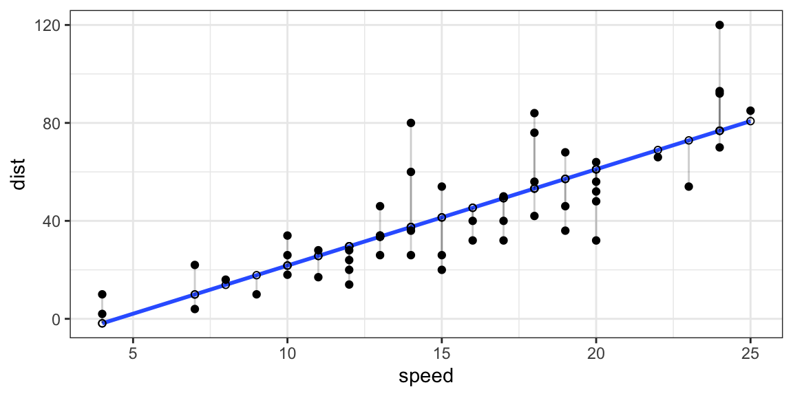
Figure 7.1: Plot of the residuals from a regression line.
As we said, before building our first regression model, it is important
to have an idea about the theoretical relationship between the variable
we want to study. In the case of the dataset cars, we know that speed
has an impact on the breaking distance of a car (variable dist) from our
physics studies. We can thus say that dist is our dependent variable
(\(y\)), and speed is our independent variable (\(x\)).
We can fit the model in the following way. Inside the lm() function
place the dependent variable ~ independent variable, comma the dataset
in which they are contained. Note that the formula 1.1 in the lm()
function is written as y ~ x.6 The code chunk below draws a
summary and the plot of the relationship between the speed of a car and
the breaking distance.
Code
The output of the summary of our regression model (Figure 7.2) must be read in the following way in order to have a brief idea on the model that we built. The first step is to look at the Multiple R-squared, this number tells us which percentage of the data is explained by the model (65.1% in this case), and thus how significant our model is. If the model has an appreciable power to explain our data, we then analyze the coefficients’ estimates and their significance level. We see here that speed has a p-value lower than 0.001 (thus highly significant7) and that one unit increase in speed means 3.9 units of increase in distance. However, there is also a slightly significant intercept, \(\beta_0\), which means that there are factors which are not present in the model and that could further explain the behavior of our dependent variable. From a theoretical perspective this makes sense, in fact, the type of tires, the weight of the car, the weather conditions (etc..) are some additional factors that are missing in our model and could improve our understanding of the phenomenon.
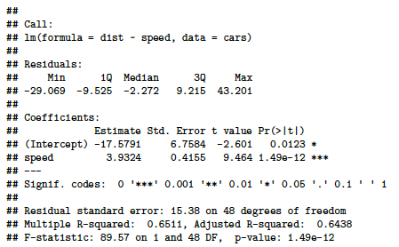
Figure 7.2: Linear regression model summary output.
Whether simple linear regression is a useful approach for predicting a response on the basis of one single independent variable, we often have more than one independent variable (\(x\)) that influence the dependent variable (\(y\)). Instead of fitting a separate simple linear regression model for each \(x\), a better approach is to extend the simple linear regression model. We can do this by giving each independent variable (\(x\)) a separate slope coefficient in a single model. In general, suppose that we have \(p\) distinct independent variables (\(x\)). Then the multiple linear regression model takes the form (7.5):
\[\begin{equation} y\approx\beta_0+\beta_1x_1+\beta_2x_2...+\beta_px_p+e \tag{7.5} \end{equation}\]
where \(x_p\) represents the \(p^{th}\) independent variable, and \(\beta_p\) quantifies the association between that variable and the dependent variable \(y\). We interpret \(\beta_p\) as the average effect on \(y\) of a one unit increase in \(x_p\), holding all other independent variables fixed. In other words, we will still have the effect of the increase of one independent variable (\(x\)) over our dependent variable (\(y\)), but “controlling” for other factors.
In order to include more independent variables into our model, we use
the plus sign. The formula in R will then be y ~ x1 + x2 + x3. If we
want to use all the variables present in our dataset as independent
variables, the formula in R will be y ~ . where the dot stands for
“everything else”. Another possibility is to have an interaction term.
An interaction effect exists when the effect of an independent variable
on a dependent variable changes, depending on the value(s) of one or
more other independent variables (i.e. \(y=x*z\)). However, interaction
terms are out of the scope of this manual.
To make an example, we can use the dataset swiss, which reports Swiss
fertility and socioeconomic data from the year 1888. Following some
models with a different number of variables used.
Code
When we perform multiple linear regression, we are usually interested in answering a few important questions in order to reach our goal: find the model, with the lower number of independent variables that best explains the outcome. The questions are:
Is at least one of the \(x_1, x_2, . . . ,x_p\) useful in explaining the independent variable \(y\)?
Do all the \(x_1, x_2, . . . ,x_p\) help to explain \(y\), or is only a subset of them sufficient?
How well does the model fit the data?
In order to answer the questions above we need to do a comparative
analysis between the models. Analysis of Variance (ANOVA) consists
of calculations that provide information about levels of variability
within a regression model and form a basis for tests of significance. We
can thus use the function anova() in order to compare multiple
regression models. When ANOVA is applied in practice, it actually
becomes a variable selection method: if the full model is significantly
different (null hypothesis rejected), the variable/s added by the full
model is/are considered useful for prediction. Statistic textbooks
generally recommend to test every predictor for significance.
7.3 Logistic Regressions
Whether independent variables can be either continuous or categorical, if our dependent variable that is logical (1,0 or TRUE,FALSE), we will have to run a different kind of regression model: the logistic model (or logit model). This model gives us the probability of one event (out of two alternatives) taking place by having the log-odds (the logarithm of the odds) for the event be a linear combination of one or more independent variables.
Using the glm() function (Generalized Linear Models), and the argument
family="binomial", we can fit our logistic regression model.
Code
Its output (Figure 7.3) must be interpreted as follows. An increase in miles per gallons (mpg) increases the probability that the car has automatic transmission by 31%, and this increase is statistically significant (p-value<0.01). In this case we do not have the Multiple R-squared to assess the significance of the model, but we will have to look at the Residual deviance tells us how well the response variable can be predicted by a model with p predictor variables. The lower the value, the better the model is able to predict the value of the response variable.
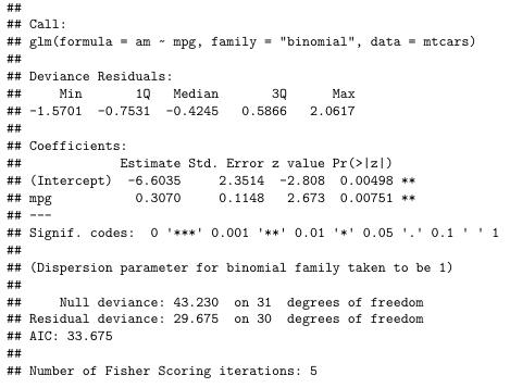
Figure 7.3: Logistic regression model summary output.
7.4 Exercises
James, G., Witten, D., Hastie, T., & Tibshirani, R. (2021). An Introduction to Statistical Learning (Vol. 103). Springer New York. Available here. Chapter 3.6 and 3.7 exercises from 8 to 15.
R playground, section 7 - T-tests and Regressions